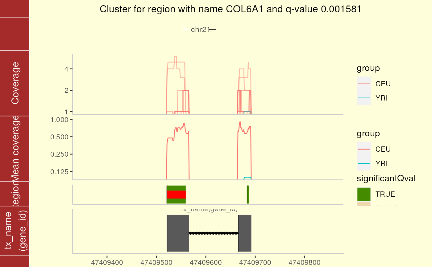
For a given region found in calculatePvalues, plot the coverage for the cluster this region belongs to as well as some padding. The mean by group is shown to facilitate comparisons between groups. If annotation exists, you can plot the trancripts and exons (if any) overlapping in the vicinity of the region of interest.
plotCluster(
  idx,
  regions,
  annotation,
  coverageInfo,
  groupInfo,
  titleUse = "qval",
  txdb = NULL,
  p.ideogram = NULL,
  ...
)
Arguments
- idx
A integer specifying the index number of the region of interest. This region is graphically highlighted by a red bar.
- regions
The
$regionsoutput from calculatePvalues.- annotation
The output from running matchGenes on the output from calculatePvalues.
- coverageInfo
A DataFrame resulting from loadCoverage using
cutoff=NULL.- groupInfo
A factor specifying the group membership of each sample. It will be used to color the samples by group.
- titleUse
Whether to show the p-value (
pval), the q-value (qval) or the FWER adjusted p-value (fwer) in the title. IftitleUse=nonethen no p-value or q-value information is used; useful if no permutations were performed and thus p-value and q-value information is absent.- txdb
A transcript data base such as
TxDb.Hsapiens.UCSC.hg19.knownGene. IfNULLthen no annotation information is used.- p.ideogram
If
NULL, the ideogram for hg19 is built for the corresponding chromosome. Otherwise an ideogram resuling from plotIdeogram.- ...
Arguments passed to other methods and/or advanced arguments. Advanced arguments:
- maxExtend
The maximum number of base-pairs to extend the view (on each side) before and after the region cluster of interest. For small region clusters, the one side extension is equal to the width of the region cluster.
- colsubset
Column subset in case that it was specified in preprocessCoverage.
- forceLarge
If
TRUEthen the data size limitations are ignored. The window size (region cluster width + 2 timesmaxExtend) has to be less than 100 kb. Note that a single plot at the 300kb range can take around 2 hours to complete.
Value
A ggplot2 plot that is ready to be printed out. Tecnically it is a ggbio object. The region with the red bar is the one whose information is shown in the title.
Details
See the parameter significantCut in
calculatePvalues for how the significance cutoffs are
determined.
See also
loadCoverage, calculatePvalues, matchGenes, plotIdeogram
Examples
## Load data
library("derfinder")

## Annotate the results with bumphunter::matchGenes()
library("bumphunter")
#> Loading required package: S4Vectors
#> Loading required package: stats4
#> Loading required package: BiocGenerics
#> Loading required package: generics
#>
#> Attaching package: 'generics'
#> The following objects are masked from 'package:base':
#>
#>     as.difftime, as.factor, as.ordered, intersect, is.element, setdiff,
#>     setequal, union
#>
#> Attaching package: 'BiocGenerics'
#> The following objects are masked from 'package:stats':
#>
#>     IQR, mad, sd, var, xtabs
#> The following objects are masked from 'package:base':
#>
#>     Filter, Find, Map, Position, Reduce, anyDuplicated, aperm, append,
#>     as.data.frame, basename, cbind, colnames, dirname, do.call,
#>     duplicated, eval, evalq, get, grep, grepl, is.unsorted, lapply,
#>     mapply, match, mget, order, paste, pmax, pmax.int, pmin, pmin.int,
#>     rank, rbind, rownames, sapply, saveRDS, table, tapply, unique,
#>     unsplit, which.max, which.min
#>
#> Attaching package: 'S4Vectors'
#> The following object is masked from 'package:utils':
#>
#>     findMatches
#> The following objects are masked from 'package:base':
#>
#>     I, expand.grid, unname
#> Loading required package: IRanges
#> Loading required package: Seqinfo
#> Loading required package: GenomicRanges
#> Loading required package: foreach
#> Loading required package: iterators
#> Loading required package: parallel
#> Loading required package: locfit
#> locfit 1.5-9.12 	 2025-03-05
library("TxDb.Hsapiens.UCSC.hg19.knownGene")
#> Loading required package: GenomicFeatures
#> Loading required package: AnnotationDbi
#> Loading required package: Biobase
#> Welcome to Bioconductor
#>
#>     Vignettes contain introductory material; view with
#>     'browseVignettes()'. To cite Bioconductor, see
#>     'citation("Biobase")', and for packages 'citation("pkgname")'.
library("org.Hs.eg.db")
#>
genes <- annotateTranscripts(
    txdb = TxDb.Hsapiens.UCSC.hg19.knownGene,
    annotationPackage = "org.Hs.eg.db"
)
#> Getting TSS and TSE.
#> Getting CSS and CSE.
#> Warning: some group names are NAs or duplicated
#> Getting exons.
#> Warning: some group names are NAs or duplicated
#> Annotating genes.
annotation <- matchGenes(x = genomeRegions$regions, subject = genes)

## Make the plot
plotCluster(
    idx = 1, regions = genomeRegions$regions, annotation = annotation,
    coverageInfo = genomeDataRaw$coverage, groupInfo = genomeInfo$pop,
    txdb = TxDb.Hsapiens.UCSC.hg19.knownGene
)
#> Parsing transcripts...
#> Parsing exons...
#> Parsing cds...
#> Parsing utrs...
#> ------exons...
#> ------cdss...
#> ------introns...
#> ------utr...
#> aggregating...
#> Done
#> Constructing graphics...
#> Warning: longer object length is not a multiple of shorter object length
#> Warning: log-2 transformation introduced infinite values.
#> Warning: log-2 transformation introduced infinite values.

## Resize the plot window and the labels will look good.
if (FALSE) { # \dontrun{
## For a custom plot, check the ggbio and ggplot2 packages.
## Also feel free to look at the code for this function:
plotCluster
} # }